branding

Susquehanna Greenway

The Susquehanna Greenway encompasses the entire length of the Susquehanna River as it flows within Pennsylvania. Once completed, the Susquehanna Greenway will become the largest greenway in Pennsylvania, linking natural, cultural, historic, and recreational resources along the 500-mile corridor.

The Susquehanna Greenway Partnership (SGP) is the 501(c)3 non-profit dedicated to advancing the vision of the Susquehanna Greenway. SGP works with partners to grow this network, inspire people to engage with the outdoors, and transform communities into places where people want to live, work, and explore.

MERJE worked with the Susquehanna Greenway Partnership staff to develop identities for both the “organization” (SGP), as well as the “physical trail” (Greenway).

The Partnership identity builds on the acronym SGP and communicates a trustworthy image through a strong use of typography, separating it from the Greenway identity, which expresses a more illustrative style to reflect the on-trail experience.

The related but separate identites have a common design language, but still serve the unique requirements of the users, as well as the variety of applications.

John Burroughs Black Creek Trail

The John Burroughs Black Creek Trail, located in Ulster County, NY, is a multi-modal 11-mile trail linking Illinois Mountain to the Hudson River through the Black Creek corridor. The goals of the trail development are to create a regional recreation destination, conserve the sensitive local ecology, and promote economic development within the Towns of Esopus and Lloyd, while connecting people to the writing, legacy, and natural world of John Burroughs.

MERJE has been contracted by Scenic Hudson, to work with local stakeholders including John Burroughs Nature Sanctuary, Ulster County, NYS Department of Environmental Conservation and the Towns of Esopus and Lloyd, on the design and planning of a comprehensive branding, wayfinding and interpretive signage program.

The design looks to the writing of John Burroughs for inspiration, takes cues form the dense forest like experience and incorporates natural materials and a rustic aesthetic to reflect the environment. The wayfinding addresses the multi-use aspect of the various segments of the trail from from biking, to paddling and hiking. Trailheads, information kiosks, maps and directional signs will help guide visitors along the trail, while telling the story of this uniquely preserved area.

Crossway Trails

The Michiana Area Council of Governments is working with MERJE to develop a new brand for the Michiana Area Trail Network. Trails that cross through 6 counties and two states will be branded as one trail system and have marketing and signage elements developed to unify the evolving network.

Interviews and design charettes were held with stakeholders and the public to gather insight of how the trails are viewed and used by residents. An on-line survey was also posted to gather additional public input. After reviewing the feedback, design concepts for a Trail System Logo were presented to the stakeholders and the public. Feedback was again gathered, revisions were made, and final logo designs were presented.

918 Trails (INCOG)

The Indian Nations Council of Governments (INCOG) is a voluntary association of local and tribal governments in the Tulsa metropolitan area in northeast Oklahoma. INCOG provides planning and coordination services to assist in creating solutions to local and regional challenges. As part of the regional Trail Master Plan (GO Plan) the organization realized that many of the local trails have yet to see their maximum potential due to a lack of signage and the perceived disconnect of the existing trail system.

INCOG hired MERJE to develop a new trail system identity that would recognize the full trail network under an overall brand, but at the same time maintaining the recognition of existing trail names and logos. MERJE worked with stakeholder groups from across the 5 counties and numerous cities to develop the new logo and sign standards.

The system name originates from the local area code that captures the entire region and has significant recognition equity. The logo plays on the unique feature of the region, green lush environment, rivers and horizons. Brand imagery looks to communicate, the community involvement, family friendly events and the promotion of outdoor activities, such as mountain biking.

Village of Homer Glen

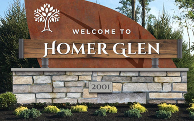
Homer Glen, Illinois, is an upscale suburban gem located approximately 25 miles southwest of downtown Chicago. Incorporate in 2001, Homer Glen is one of Illinois newest municipalities. The Village offers a unique blend of open space, residential developments and vibrant commercial corridors, but its heritage in agriculture, existing farmlands and connection to nature makes it a unique oasis to the adjacent commercial municipalities.

MERJE has been working with a Steering Committee, Economic Development Committee, Village Board and the local community on the development of a new identity, tagline, marketing materials and gateway signage. The design process included visual exercises with the working groups, as well as residents, online surveys and formal presentations. The logo builds on the idea of “community & nature in harmony” and the color palette reflects Autumn, the time of year, where Homer Glen shines. The tagline “ You Know You Are Home” reflects the feeling you get when you transition from the busy suburban communities to the more serene and open environment of Homer Glen.

Lincoln Highway

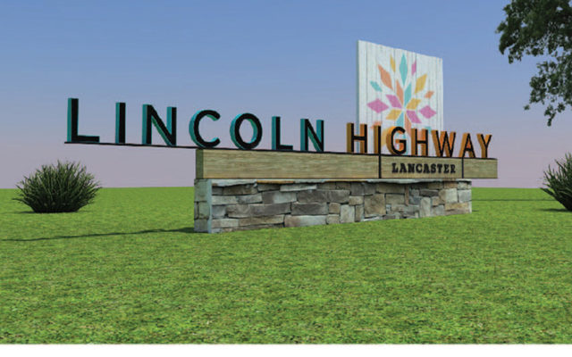
Located in the center of Lancaster County, the Lincoln Highway corridor is home to numerous attractions, hotels, outlet stores, restaurants and theaters, all surrounded by Amish farmland and culture.

MERJE was hired to develop branding, gateway elements and wayfinding signage for the 2.3 mile stretch of roadway. The design process included investigation into the local culture, community input, tourism strategies and coordination with a multi-year streetscape improvement project.

The brand identity is inspired by local Amish hex signs and Mennonite quilt patterns, while being comprised of multiple pieces reflecting the variety of destinations and activities available to a visitor. The colors are friendly, bright and energetic.

Gateways elements utilize local materials, such as barn wood beams, indigenous stone, exposed industrial connections and handcrafted graphic applications. The wayfinding signage has to meet MUTCD and PennDOT engineering requirements for Community Wayfinding, but at the same time extends the brand into the environment and helps to reinforce the sense of place and identity of Lincoln Highway.

Princeton Public Library

Princeton Public Library

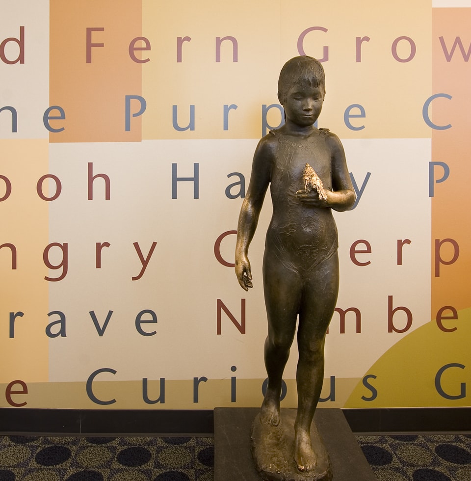
Located in the heart of downtown, Princeton Public Library is a community asset and gathering place. MERJE developed a branding and signage program that looks to compete with the popularity of the combination bookstore/cafe retail spaces.

The brand includes an icon of a person reading a book, emphasizing the “public” in public library, while the simple typography depicts the library as a friendly and approachable environment. The icon portion of the logo has been adapted for use in the identification of the library store and on merchandise for sale in the store. To identify the different sections of the library, the interior signage incorporates photographs of people reading, listening and engaging in other activities related to the library’s resources.

Missoula Pedestrian Sign Detail

Missoula

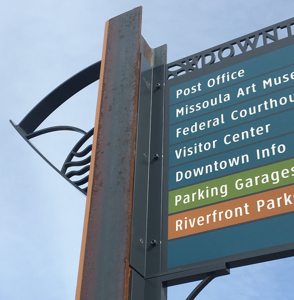
Dubbed the Garden City for its mild winters, Missoula is a bustling university community surrounded by national forests, mighty rivers and idyllic wilderness. To support the City’s continued growth, MERJE was engaged in developing a community wayfinding program that would celebrate Missoula’s cultural, recreational and educational assets.

The program divides the glacier lake City into unique districts: North and South Reserves, Airport Business, Downtown, Midtown and Fort Missoula, each with color-coded signs made of natural materials in a design that emphasizes the active outdoors. lnner city bike routes and surrounding hiking trails are marked, along with the local arts scene and connections to the University. The program eliminates the visual clutter of signage and provides a long-term plan for adaptation.

Miami wayfinding program

Miami Beach

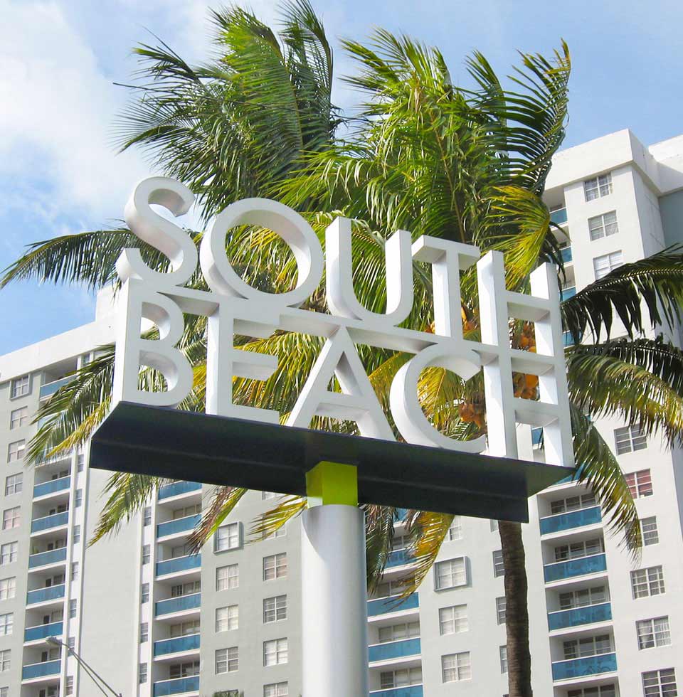
Follow the fashionistas and you’ll find Miami Beach’s white sandy shores and round-the-clock South Beach dance clubs, but you may miss the art museums, botanical garden and galleries. Tourism is big business in Miami Beach and a new signage system designed by MERJE will help you find your way on your next visit.

Working with City officials, stakeholders and the community, MERJE created a wayfinding program and brand identity influenced by Miami Beach style. The polished, ellipse-shaped post provides a modern elegance to the spine of the sign structure. The guide sign face is simple, meeting Florida Department of Transportation criteria, but the back of the sign, the panel shape and brackets take on curved forms that turn a seemingly simple sign into a distinctive element on the street. Every aspect of this inspired design helps it to integrate into an environment that has an overwhelming architectural context and visual presence.

Allentown Parks Logo

Allentown Parks

The park system of Allentown includes over 2,000 acres ranging from sprawling green vistas to pocket parks smaller than a city block. To highlight the gardens, fields and open space of Pennsylvania’s third-largest city, MERJE established a framework of design standards for the parks, including a catalogue of sign types, information hierarchies and an identity program.

Designed to enhance and promote Allentown’s green infrastructure investment, the new standards will improve community access and promote recreational opportunities for city-dwellers. Allentown’s park signage system is now an element of the comprehensive bicycle and pedestrian Trails Master Plan developed by urban designers Stromberg/Garrigan & Associates and Greenways incorporated.