Design consultants show off three new sign possibilities for Williamsburg
The times are changing in Williamsburg and so are the signs. A new wayfinding program aims to consign the infamous “Confusion Corner” to history, add gateways to the city, and develop new signs that encompass Williamsburg’s past and future.
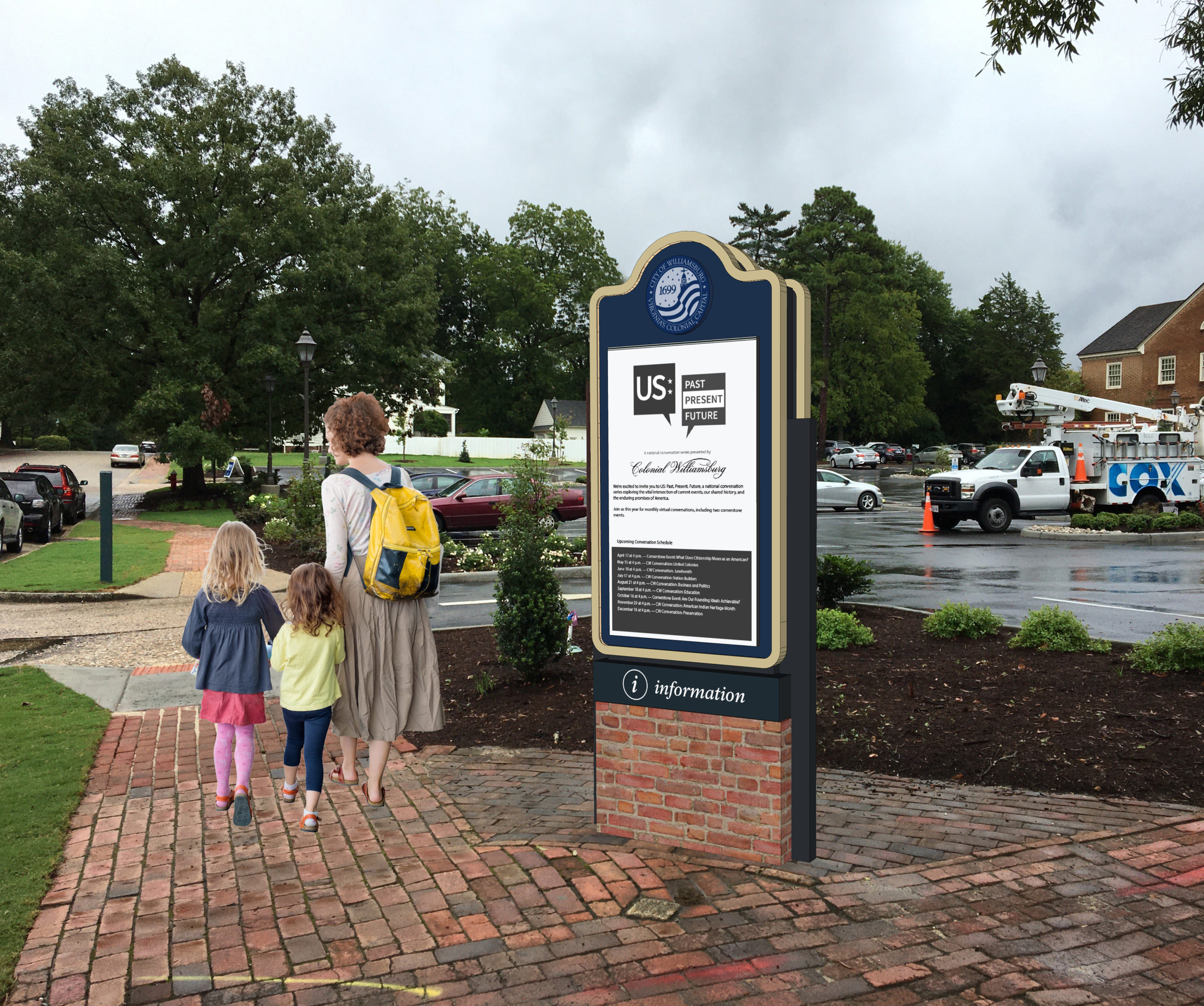
Consultants from MERJE Design highlighted how digital elements can be incorporated into the wayfinding experience during a public input meeting last week.
“There was a very high interest in digital tools and how that can be included in the program,” he said.
MERJE’s report mentions mobile apps, interactive kiosks and real-time parking. “We do want to ensure from a design standpoint that we are staying within the scale and the charm of Williamsburg,” he said. Bosio said digital elements are not necessarily flashy. He highlighted the “e-paper” design, a matte look, that’s “more appropriate to somewhere like Williamsburg where it’s not that in-your-face digital component which would not be appropriate.”
MERJE is looking to design a new “one voice” map of Williamsburg, and highlight the gateways into the historic city. Bosio spoke of differentiating major “wow gateways” such as the approaches off Interstate 64, and secondary gateways that would receive less prominent signage.
Bosio said parking became a “big conversation with many of the stakeholders.”
“You can’t just solve it only by running out there and putting signs everywhere. It really has to have a full wayfinding approach,” he said.
The parking approach would include improved signage to the Prince George Garage and user-friendly signs at the garage’s elevators.
Bosio said the elevator bank should be “gateways to your experience of Williamsburg” and contain welcoming messages and useful information.
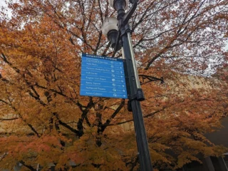
Glen Swantak of MERJE highlighted three different themes the consultants have drawn up for new signage.
The first would be “whimsical” and reflect the historic trades in Williamsburg. Designs showed signs with historical characters walking on the tops of the signs. The second concept incorporates the circular shape of the city seal with more curved elements. The third concept would see more formal designs and green parking signs.
“The first one was a little bit about the craftsmen and the trades, the second was more about the city brand. This one is more formal and ornamental,” Swantak said of the third concept.
Councilwoman Barbara Ramsey supported signage that would be unique to Williamsburg. She said she initially favored the whimsical designs but is also a fan of the second concept that incorporates the city brand.
“Doug Pons, the mayor, and I have talked about ways we can bring in something that’s unique to Williamsburg, whether it be the tri-cornered hat or the Revolutionary soldier; something that creates that Instagram moment whether they are standing by a parking sign or elsewhere in the city,” she said.